Thursday 11 August 2011

Independent Study Week 5

Zaha Hadid Poster
Layout: A double page spread, well layed out.  The architecture takes up nearly one whole page, making it a dominant feature. The text flows around this architecture and the car to the left, demonstrating the flow of character Zaha Hadid possesses. The use of carefully cropped images fitted within the title height gives an orderly effect, contrary to the flow, thus making them more visible to the naked eye.

Proportion: The text is in a grid of four, and though small, is enough to be informative and short enough not to be too intimidating. The scaled image of the architecture draws the viewers eyes first, the eye flows down the curve and torwards the text, which then goes to the vehicle then back up to the text. The proportion of the large image taken one whole page, and the text was quite effective and it took away the overwhelming effect that small text might give.

Font: The title has extra large typeface and sports an unique font different from the default. The use of bold text within normal text gives the impact a title needs. The font of the actual spread is small, and it flows around the pictures, giving them character. I find the font a little bit small, and some people would rather not read all those small text. A quote or statement starts of, in a larger font giving that 'professional sheen' to the overall appearance of the magazine spread.

Colour:
The black and white colours of this poster contrast well with each other and creates a simple but stylish look to the poster. White font are used in black backgrounds and black font used in white.

Week 4 - Refinements

300 Word Process Report
The first assignment for ARCH 1390 was one which is currently fun, but time consuming. Throughout this assignment, I have explored around five programs- 3DsMax, Sketchup, Crysis, Build AR and SPORE. I plan to be quite efficient in all of these programs at the end of this assignment. Requirements for this assignment include a blog, sketches, photographs, and of course, the digital work. 

This assignment started off by researching a designer and their work, and from that, drawing our own inspirations for our work. I have drawn inspiration from Zaha Hadid and her buildings - The Maggie Centre and the Chamber Hall. I chose these two architecture as they are the opposites- one building is sharp and acute, the other one flowing and curved. 

The next process was to make paper models based on the buildings, then design clients using SPORE. We had to be creative and basically, this exercise was fun but it challenged your mindset. I wanted my clients to be totally different from each other. What resulted was a client living in the high, snowy mountains with a quick temper, and a client in the depths of the sea, full of grace and serenity. I have named my clients Lorcan (a snowy leopard with wings) and Seacil (a female sea dragon). 

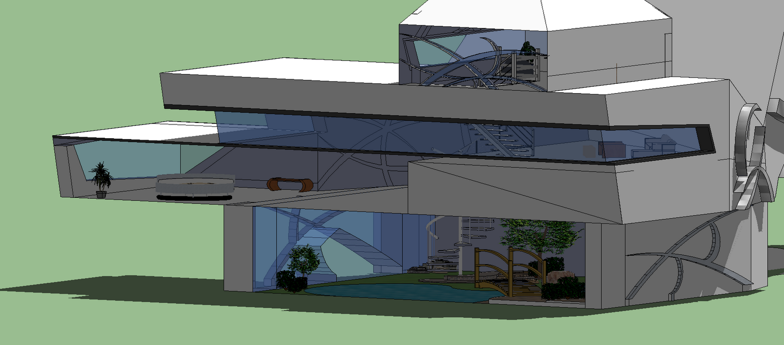
What came next was the challenging part. Putting your paper model into digital context. I found this part quite challenging, and only so far modeled one building successfully. I will continue to do my model but meanwhile, I want to get this done first. I've got Lorcan's building done first, and it draws influence from the Maggie Centre, following the sharp and crisp edges. After the modelling of Seacil's building, I will start on the poster, which I will do relatively fast. Through Zaha Hadid's thinking of character and expression, I have attempted to incorporate the expressionism of her architecture into my work and I hope my end result won't look too far away from my goal.


Grid Concept Layouts
This poster is more for show of graphics design than being informative. The number of pictures and the size may vary on the final product.


This is influenced by Zaha Hadid's poster. The colour theme might actually be black and white as well. At the moment it all seems very 'straight forward' but I will try diffuse the strict grid lines using the background. The text would flow around the images as well.


Sunday 7 August 2011

Independent Study Week 4

Augmented Reality Inspiration

This video gave me a clearer understanding of what I might be doing for my augmented reality. 
What captivated me was the animations of the cars going to and fro, in and out of the building. 
I find it interesting how the building can change colours as well. The interior of the building was just awesome, and it shows what an useful tool augmented reality can be- in the future, if you build a house and it's not ready to be released but you need some feedback, just send it over for others to see discretely :P

Final 6 Markers


Initial 6 Markers
Brief:  Words display, brief or just another shot of the model in environment

Rotation: The Model Rotates, showing the viewer a view from every angle

Section: Section cuts and views showing interior

Right Elevation: Shows the model's right elevation

Left Elevation: Shows the Model's Left Elevation

Full Shot: Shows the full model from afar
FINAL Box with Markers


Week 3 - Augmented Reality

Lorcan Model Final


Lorcan's Model Developed (Exterior)
I have taken Jackey's advice in making Lorcan's building to be more architectural than suiting the client. I have also realised that if I am to have terrain in my augmented reality, making it in Crysis would be a huge pain, so I made a 3Ds max environment to go with the new model.


Lorcan's Model In New Environment

Chosen Model Screenshots (Lorcan)


Augmented Reality Video